Interactive Graphic Novel
14 Jan2011
By Liana Finck on Tabletmag | Tweet
Illustrator Liana Finck has started a visual question and answer blog on Tablet Magazine.
Read the first installation here.
- In: News
- Tags: Illustration
By Eszter Margit for SUDINmag | Tweet
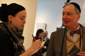
Over two hundred Jewish presenters gathered at the City Winery in New York on January 11-12 to network and celebrate Jewish culture. One of the main discussions centered around branding Jewish culture: organizers of four successful international Jewish cultural festivals discussed their unique strategies and dilemmas. Even though festival organizers think visual representation is key, there is a growing need to connect with visual artists, who truly understand the concept of their project and are able to bring Jewish concepts to mainstream audiences.
Eric Stein, Director of the Ashkenaz Festival in Toronto said that even though visual arts had been part of the festival, it has proved to be a challenge to visually represent the maturity process his festival went through during its 15 year course. ‘We always worked with the same artist to keep a consistent look, but it doesn’t really match who we are, any more,’ he noted.
Marie-Louise Albert, artistic and managing director of Chutzpah!, the Vancouver-based international Jewish festival said, ‘Our visuals are also consistent: we always work with an artist who participates at our festival that year. We are making a conscious effort to tie the visual and the performing arts.’ Marie-Louise Albert explained that their main challenge had been finding images that are able to attract the ‘mainstream’, Canadian audience to their events. Lately, the festival outsourced its publicity, marketing and social media commissions to experts who were able to promote their events to the mainstream media.
The Kracow Jewish Culture Festival, based in Poland, was launched in 1988, right after the collapse of Socialism. Director Janusz Makuch explained, their main challenge had been visually representing a culture that was wiped out during the Holocaust, yet organizers thought it should be part of Polish mainstream culture and catch the interest of the Polish audience. Therefore festival organizers wanted to show in their imagery that international Jewish culture was still alive and relevant. Makuch said, ‘23 years ago the festival had a very different logo, forming a globe and a crown. Recently we hired an Israeli artist to design our new logo: it was a fantastic challenge because he’s never been to Krakow before, so he had no connection to the location or the local culture at all. That turned out to be a good thing, he designed the clearest and most visible logo with the Hebrew letter ‘Kuf’ – the letter K also symbolizes Krakow, ‘Kulture’ and ‘Krown’’.
Panelists agreed that since the definition of Jewish culture is so broad that sometimes the visual images representing it are so general that they don’t really carry a meaning.
Ken Gould, Director of the International Jewish Music Festival in Amsterdam explained how their 15 years old festival’s visual identity went through several stages of development. In the beginning, when they operated on a low budget, organizers had their logo designed via crowd-sourcing on an internet-based design marketplace, www.99designs.com. Even though some of the proposals looked very ‘slick’, their committee felt that a hand drawn image expressed their brand the best. The following year they employed the color scheme from the logo, but was more elaborate. The latest festival operated with a larger budget, giving the organizers the opportunity to hire a professional designer. Gould said, ‘Our recent marketing challenge had been to decide how Jewish our visual identity should look. After much debate, we have agreed upon a completely abstract, naturally inspired image – it turned out to be a huge success with our audience, leadership, donors and the media.’
Festival organizers agreed that professional visuals do not only matter to the funders, also help sell advertisement and create expectations in the audience about the quality of the performances. They warned however, that if the visuals too promising and the festival doesn’t deliver good enough content, the competition will wipe them out. Part of festivals’ future mandate should be developing visual artists through residencies during their events.
- In: News
- Tags: Europe, Graphic Design, NYC
Quiet Moments ‘In Plain Sight’
12 Jan2011
Tonight, the 92Y debuts In Plain Sight, photographic works by David Akiba, 5-6:45p.m.
Weill Art Gallery at the 92nd Street Y, 1395 Lexington Avenue New York, NY.
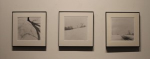
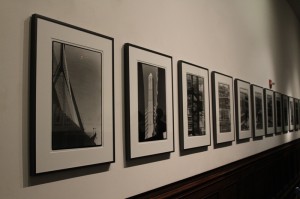
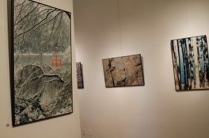
Akiba, a well known Boston photographer, presents black and white photographs of scenes in nature, both organic and industrial.
Akiba describes his work as being about the emotional response to the visual and the personal experience behind it. Akiba uses the quality of light to present dynamic contrast or lack-thereof in his subjects. Although the light, design, and composition are all very strong his his work, Akiba has is more concerned with the emotional experience than the technical aspects behind his artistic decisions.
In Plain Sight includes many photographs of nature in winter, presenting a still, quiet, and sometimes subtle experience. Akiba invites the viewer to step away from the busy world and take a moment to reflect on the beauty in nature all around us. The viewer is invited to remember these quiet moments, and reflect on the delicate beauty when outside of the gallery.
In the past Akiba focused on more aggressive and dramatic narratives including one series detailing the turmoils of separation in his family which eventually led to the mending of these ties through his art.
The park he took many of the nature photographs, The Emerald Necklace, is a designed landscape much like Central Park, yet he does not feel that this is in any way a detractor of its quality. As Akiba describes it, “you can not separate what we have built from what exists without our making it.”
David Akiba inspires us to step out of our busy lives and reflect on the awesome beauty of our world. Whether in a forest or on the city streets, it surrounds us on a daily basis.
- In: Exhibition Reviews
- Tags: NYC, Photography
By Saul Sudin | Tweet
Percy Adlon & Felix Adlon, Austria/Germany, 2010; 97m
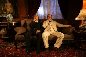
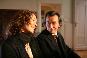
Inexplicably the opening night film of this year’s New York Jewish Film Festival, Mahler on the Couch contains no Jewish content whatsoever beyond the tangential fact that its main character was in fact born Jewish and discarded his religion, something not even mentioned in the film. Couch is the newest film from veteran German director Percy Adlon and co-writing and directing this time around is his son Felix. Together they weave the tale of 19th century Bohemian composer Gustav Mahler (Johannes Silberschneider – The Red Violin), and the marital problems that drove him to seek the counsel of Sigmund Freud (Karl Markovics – The Counterfeiters), another Jew who widely ignored his religion.
From the outset the film takes an odd approach, giving dreamlike glimpses of imagery that we are not prepared to understand yet. It is a full minute and a title sequence before we are given a context for what we are seeing – Mahler taking the train to Holland to seek a vacationing Freud. The early scenes of Freud and Mahler playing off one another are full of promise. Mahler seems too uptight and disoriented to open up, and over a stroll through the streets of the city he finally begins telling his tale of woe. Markovics plays Freud with a wonderful amount of humor and methodical eccentricities, and as his role dwindles during the course of the film, so too did my interest.
Though the title alludes to the relationship between Mahler and Freud, the real focus of the film is Mahler’s adulterous wife Alma (Barbara Romaner). Darting through the history of their relationship, we first meet her during the period in which she has already begun sleeping with founder-of-the-Bauhaus architect Walter Gropius (Friedrich Mucke) behind her husband’s back. Alma is immediately unlikable, and this context sets a foul taste in one’s mouth even when we later see her as a much more enjoyable young woman falling for Mahler during the burst of Vienna’s late 19th Century art scene. Alma goes through many loops of suppression and rebellion to the will of her husband, ultimately leaving the question of why she truly loved him in the first place ambiguous. A scene of her and Mahler in early love’s grasp is immediately followed by one of her reaction to his demands that she be a subservient wife, which includes giving up her own aspirations as a composer. No hints or indications were shown up until then that Mahler felt this way, and this 180 degree turn of a scene comes off as a bad joke, especially when this then becomes the main division between the couple for the remainder of the film. What’s more baffling though is that the very next scene jumps ahead in time again, and she is married, pregnant, and happy as the couple work on one of his compositions together. Though the emotional and tonal shifts she is forced to portray show off Romaner’s skill as an actress, her character is an ungainly mess.
By far the most distracting thing about the film is the constant stream of exposition we are given by side characters directly addressing the camera. In a story where we are given all flashbacks through the memories of a man opening his heart and mind to psychoanalysis, surely all the flashbacks would be from this characters perspective? And yet, we get monologues that directly address the audience with countless amounts of exposition as if additional people were given a chance to chime in on Mahler’s analysis. The facts do give a fuller understanding of the many real life people portrayed in the film (including other artistic notables like Gustav Klimt and Max Burckhard), but this is lazy and erratic storytelling.
The lighting and costumes shine as the most solid aspects of the film, and the score, made up of original compositions by the real Gustav Mahler as conducted by Esa-Pekka Salonen is as powerful as Mahler’s work has ever been. Unfortunately, each of these virtues gets buried under misuse. It is hard to appreciate well-lit cinematography when the camera’s use is erratic and odd, which one can only surmise was to try to accentuate the dreamlike quality of Mahler’s memories. Chunks of the film seem like excuses to set imagery to the music of Mahler, and sometimes cheap and clichéd moments are not at all helped by the score. When Mahler discovers a letter written to Alma by her secret suitor, the music stings suddenly like a parody of an overly dramatic television soap opera, not the respected stage operas that Mahler had written.
Finally, after a bleak first act, breathe of fresh air second, and a struggling third act, Mahler on the Couch ends without giving a conclusion to the Mahler vs. Alma relationship, the ultimate insult. So many moments felt accentuated and stretched to fill the running time and yet the closing text summing up the couple’s remaining time together hints at a much more interesting story left untold. Sometimes the world of modern Jewish cinema can be extremely limited in its offerings, but the question that keeps rolling around is why feature one as flawed as this? The New York Jewish Film Festival should be the worldwide leader in focusing on the best and brightest of current Jewish movies, but Mahler on the Couch says little about either Judaism or cinema.
Mahler on the Couch opens the 20th Annual New York Jewish Film Festival at Lincoln Center’s Walter Reade Theater with screenings this afternoon and evening.
The festival, presented by The Jewish Museum and the Film Society of Lincoln Center, runs January 12th – 27th, 2011.
For a complete schedule of films and to purchase tickets, visit http://filmlinc.com/wrt/onsale/nyjff.html
- In: Events|Exhibition Reviews
- Tags: Art History, Film, NYC
By SUDINmag | Tweet
ISRAMERICA in collaboration with SUDINmagazine, Artists4Israel, and Ross Den Photography present: ISRAFEST AT CITY WINERY!
Wednesday, January 12th
7-:11:30pm
City Winery
155 Varick Street
New York, NY
The hottest Israeli and Jewish FASHION and ART will be featured at the ISRAMERICA event on Wednesday, January 12th at City Winery! Come out and be fashionable!
FASHION portion hosted by Oshi Hadari
…
Join us for a special night of music, comedy and arts as we welcome the incomparable Israeli pop superstar Rami Kleinstein and our dynamic young ISRAMERICA collective.
This intimate concert will showcase Rami’s piano virtuosity as part of his Kleinstein & Piano tour. Isramerica will debut ISRAFEST: A MEGA EVENT filled with Israeli and Jewish-American Music, Fashion and Art, this multi-genre bridging show should not be missed!
Featuring:
The ISRAMERICA House Band (with Judah Gavra, Omer Shaish, Talya Smilowitz, Stav Livne and Natalie Tenenbaum) | THE GROGGERS | Paula Vaulstein | Rony Corcos | Noah and the Maccabees | and a snippet from Sivan Hadari’s Award-winning one woman show: The Emancipation of the Sassy Jewish Woman.
The walls at City Winery will be adorned with extraordinary visual art, paintings, murals and more all courtesy of the talented pro-Israel artists from Artists 4 Israel and SUDINmagazine. The back walls will be draped with an endless array of Ethnic, Pro-Israel fashion items and accessories. But most importantly will be the Kick-Tuchess performances on stage by these young, breakout Isramerican artists.
More info and tickets here: http://www.citywinery.com/events/127766
- In: Events
Hadas Gallery Opens on Myrtle Ave in Brooklyn
10 Jan2011
*Artist talk January 25th see below for details*
The Hadas Gallery located on Myrtle Avenue alongside the world renowned Pratt Institute opened its doors yesterday with an exhibition titled “Depth, Balance, Surface.”
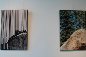
The exhibition features nature photography by Brooklyn artist Richard W. Golden who finds beauty in the abstraction found in nature. He focuses on how texture, form, and space come together in dynamic compositions.
“Something that attracted me was the balance in it- I couldn’t take away any part [of the image] and still have the photograph feel complete.”
Golden invites the viewer into the mystery of the image, of mystery he himself is in constant pursuit. Golden’s passion for visual elements found in nature show an appreciation for the significance of a designed world.
DepthBalanceSurface
The photographic works of Richard W. Golden
Curated by Joshua H. Stulman,
Open through January 31st, 2011
Hadas Gallery
543 Myrtle Ave
Brooklyn, NY 11205
Gallery Hours
Sunday 11-5pm
Monday-Thursday 10-6pm
Artist Lecture
Tuesday January 25, 12:30-1:30pm
The Hadas Gallery is looking forward to future exhibitions that give a professional venue for local artists and art students to show their work in the public sphere. For more information contact info@hadasgallery.com.
- In: Exhibition Reviews
- Tags: Jewish Galleries, Photography
Jewish Calligraphy: Ashkenazi and Sephardi
6 Jan2011
By Ajax Union on JewishArtBlog | Tweet
“The art of beautiful writing†not only goes back thousands of years, as seen through Jewish art, but is “an integral part of the cultural legacy of the Jew.†Of all the tradition and symbols of traditional for the Jewish people, perhaps none are more telling than Hebrew calligraphy.
But which Jews are we discussing, exactly? Those individuals who are familiar with the Jewish culture and its history are aware of the two different sects of European Jews: Ashkenazi, the descendants from central and eastern Europe, and Sephardi, the Jewish descendants from Spain.
Perhaps less known is the fact that Ashkenazi and Sephardi descendants often have strikingly similar traditions with slightly different rites and practices. This is as true with their traditional style of Hebrew calligraphy as it is with anything else.
In The Hebrew Letter: Calligraphic Variations by Ismar David, the author explains to us the difference in Asheknazi and Sephardi calligraphy in Jewish art:
“The Sephardi writing tradition is the direct continuation of earlier Oriental writing and shows, as far as letter-forms are concerned, a minimum of foreign influence. The Ashkenazi tradition reflects to a much higher degree the aesthetics that guided European scribes of the late Middle Ages ad early Renaissance.â€
Hebrew calligraphy truly is one of the oldest and most noticeable traditions in Jewish history, for both Ashkenazi and Sephardi.

- In: Inspiration
- Tags: Calligraphy, Hebrew
Art and Faith
5 Jan2011
By Natalia Kadish | Tweet
In the holy language of Hebrew nothing is coincidental or superfluous. The Hebrew words Emunah (faith) and Amenut (art) share the same root letters as one of the most familiar words in the world, the word Amen. Amen, in fact, is spoken as written in every context in which it is used. When a person says Amen it is a pure and simple declaration of their trust and faith; Amen expresses a spiritual/emotional state which can not be put into words. This is why the three letters of Amen form the root of the word for art. Art is, in itself, an attempt to draw into this physical world that which is inherently transcendental. Art, at its best, is an expression of the artist’s faith, their affirmation of the relationship between the spiritual world and its physical counterpart.
- In: Inspiration
- Tags: Hebrew
The publication “Fringes – Jewish Art as an Israeli Periphery” is a continuation of a series of publications published under the auspices of the Leiber Center of Bar-Ilan University. The series focuses on research and documentation of contemporary Jewish art discourse in Israel. The series in general, and the current volume in particular, aim at sketching broad guidelines for topics pertinent to the field of Jewish art within the Israeli sphere. The basic hypothesis of the current edition is that Judaism is conceived as a “subterranean” element of Israeli culture. The discussion considers the viability and elasticity of distinctions between the religious and the secular. This perspective favors a harmonic understanding, by which religiosity and secularism are not opposites, but rather intertwined inseparable concepts. Alongside the discussion concerning canonical artists, this publication relates mainly to peripheral tendencies and non-mainstream artistic groups, aiming to reveal their qualities as well as their limitations.
– David Sperber דוד שפרבר
By PresenTense | Tweet
PresenTense Magazine — a publication highlighting young Jewish creativity and innovation — is seeking artistic submissions for their upcoming issue, focusing on social action and how this generation of young Jews is making a difference.
In particular, they are looking for:
*Cover: A cover photo or illustration speaking to the idea of community organizing, showing people in action for the common good
*Endpage: A one-page illustration that speaks to social action in a humorous, thought-provoking, or creative way.
Deadline for submission is February 1, 2011.
Please submit all photography and illustrations on this theme to deborahfishman@presentense.org
- In: Call for Entries
- Tags: Illustration, Photography


